Building a Flexible Layout with Flexbox
Learn how to create a flexible and responsive layout that dynamically adapts to available space using flexbox, allowing your web page to make the most of its content area.
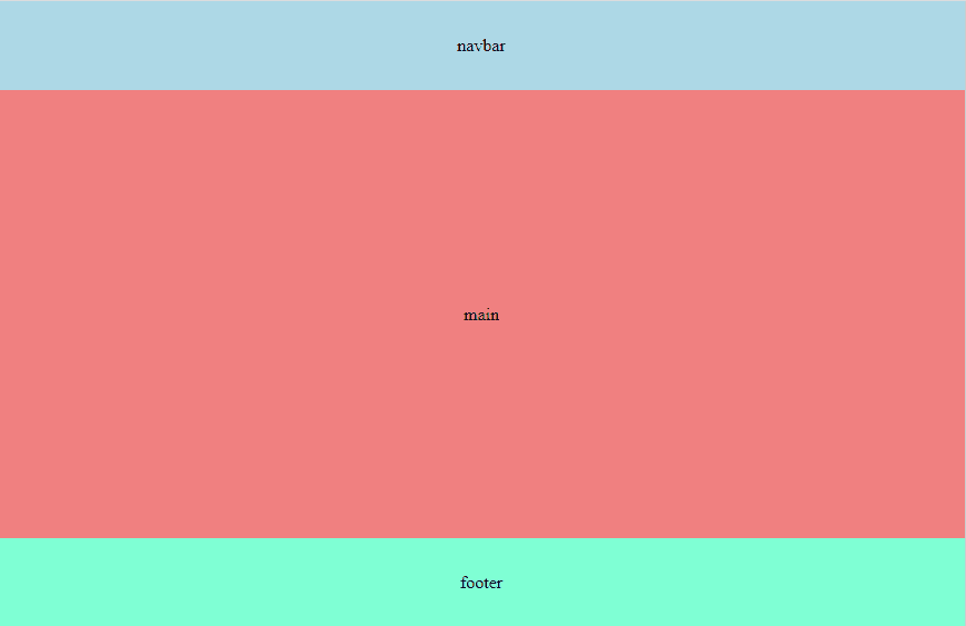
Almost every web page consists of a header, a main section, and a footer. In this short guide, we will explore how to build a layout where the main section automatically occupies the available space using flexbox.
Based on a simple HTML structure
<body>
    <header>navbar</header>
    <main>main</main>
    <footer>footer</footer>
</body>
We will apply the following styles
body {
  min-height: 100dvh;
  display: flex;
  flex-direction: column;
}

main {
  flex: 1;
}
We use min-height: 100dvh; so that the body takes the entire height of the viewport, which changes as the browser UI expands or contracts.
This is a new unit that replace 100vh which fix the height for mobile heights.
When setting flex-direction: column on the body, the elements stack vertically. For main, we will apply flex: 1, which means it will automatically occupy all the remaining available space in the column after space has been allocated to other elements, such as the header and footer.
Getting:
Note: I added additional styles for illustrative purposes only.
There are other alternatives, where, for example, the height of main is set to 100vh - (header height + footer height), but it is a more complex solution as it requires calculations. Additionally, using flexbox is simpler and more scalable.